One photograph used to be one asset.
A horizontal campaign image might appear on a website or in an advertisement. A vertical photograph would be commissioned for another placement. Social teams would crop, resize or request additional versions until the campaign accumulated enough material to cover every channel.
Generative AI and automated design tools are challenging that production model.
On August 7, 2026, Adobe published a Firefly tutorial led by designer and educator Angelo Montilla demonstrating a workflow that begins with one brand-aligned image and ends with scheduled campaign content for Instagram, TikTok and YouTube.
The example is straightforward: a woman stands against a clear blue sky wearing sunglasses and headphones while holding a white soda can. Montilla starts with that base image, uses it as a reference for further generation, takes the resulting campaign visual into Adobe Express, adds typography and then adapts the composition to multiple social formats.
The promise is compelling.
Create once. Adapt everywhere.
But the workflow also exposes an important limitation of that idea.
A single brand image can increasingly become the source for an entire social campaign. That does not mean the exact same composition should simply be resized everywhere.
The difference between those two ideas is becoming one of the most important questions in modern brand photography. Could a Single Product Photo Become the Starting Point for an Entire Brand Identity?
Adobe Starts With One Brand-Aligned Image
Adobe’s social campaign workflow begins in Firefly with a base visual.
Montilla describes starting from an image generated with Firefly Image 5. The photograph-like visual contains a female subject, headphones, sunglasses, blue sky and a white soda can that will become the product at the center of the fictional campaign.
He then uses the visual as a reference image while adding other brand assets, including a product reference.
That distinction matters.
The workflow does not ask AI to invent every campaign image independently.
It gives the system visual references.
Color, product appearance, subject treatment and styling can therefore carry from one generation into another.
For brands, this represents a potentially significant shift.
A strong master photograph or campaign image can become more than a finished advertisement. It can become visual source material for an entire family of assets.
One Image Can Now Produce Several Formats Very Quickly
The workflow becomes particularly interesting when the image reaches Adobe Express.
Montilla demonstrates adding campaign typography before adapting the design to four specific outputs:
- Instagram square: 1080 × 1080 pixels
- Instagram portrait: 1080 × 1350 pixels
- TikTok: 1080 × 1920 pixels
- YouTube: 1280 × 720 pixels
Those dimensions illustrate the problem better than almost any branding theory could.
The same campaign has to move from a square to a relatively tall portrait, then into an extremely tall vertical frame, and finally into a wide horizontal composition.
A single photograph cannot occupy those four shapes identically.
Something has to move.
Something may have to become larger or smaller.
Background may need to be extended.
Typography needs a new position.
The relationship between product and person can change.
The central question is therefore not whether technology can resize an image.
It can.
The more important question is whether the visual idea survives the resize.
Cropping Is A Branding Decision
Cropping often gets treated as a technical operation performed at the end of production.
For brand imagery, it is a creative decision.
Imagine a horizontal photograph of a runner crossing an empty landscape.
The athlete occupies the right third of the frame. A huge open sky on the left provides space for a headline.
The composition works because of that relationship.
Turn it into a square and much of the landscape disappears.
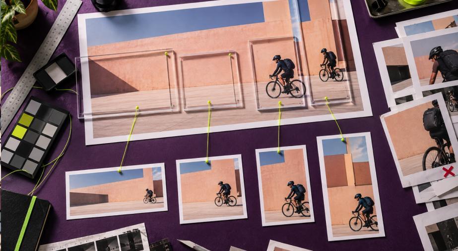
Turn it into 9:16 and almost all the horizontal environment may disappear.
Move the athlete toward the center and the original visual tension changes.
Enlarge the runner and the image becomes less about scale and environment and more about the person.
The subject remains identical.
The photograph does not.
That is why responsive brand photography needs more than a resize button.
Brands increasingly need cropping rules.
The Master Image Needs Room To Move
This shift may change how photographers compose campaign images in the first place.
Traditionally, a photographer could optimize a frame for its primary destination.
A magazine spread has a known shape.
A billboard has another.
An ecommerce product card has another.
A social campaign has no single frame.
If one master image is expected to feed multiple channels, photographers and art directors need to anticipate those transformations during production.
That can mean leaving more environmental space around the subject.
It can mean capturing a wider frame than the final hero image appears to require.
It can mean avoiding critical details at the extreme edges.
It can mean creating alternative subject placements during the same shoot.
It can also mean deliberately photographing clean background areas that can later accommodate copy.
This is not necessarily less creative photography.
It is photography designed around future flexibility.
Automatic Resize Is Only The Beginning
Adobe Express can automate a substantial part of this process.
Its Resize system offers preset social-media formats and can duplicate a design into multiple dimensions. Adobe also supports generative expansion, which can create additional image area when a new layout requires space beyond the original frame.
But Adobe’s own August 7 demonstration shows why human review remains necessary.
After automatically generating the different versions, Montilla returns to the Instagram portrait composition and manually moves and resizes the typography to better fill the available space.
That small intervention reveals something important.
Automation can solve dimensions.
It cannot guarantee hierarchy.
A headline that feels balanced at 1280 × 720 may dominate a narrow vertical design.
A product that looks appropriately sized in a square can become tiny inside a tall frame.
A person’s face may suddenly compete with text.
Every format creates a new visual relationship between the same elements.
The designer’s job becomes less about rebuilding everything and more about correcting those relationships after adaptation.
Generative Expansion Changes What “Crop” Means
There is another important difference between traditional resizing and current AI-assisted workflows.
Historically, changing aspect ratio usually meant removing information.
A wide photograph becoming vertical had to lose its left and right edges.
Generative expansion introduces another possibility.
Instead of cutting away the original photograph, software can create new visual information outside its existing boundaries.
Adobe Express describes its Expand Image feature as generating missing areas that blend with the original photograph when the image needs to fit another layout.
For simple environments, that can be extremely useful.
A studio background can become wider.
A sky can become taller.
A wall can extend behind typography.
But generated expansion also introduces a new creative responsibility.
The additional pixels were not present when the photograph was made.
Brands therefore need to decide where expansion is acceptable.
Extending an empty wall is very different from generating additional product details, architecture, people or documentary context.
The ability to make a photograph larger does not eliminate the need to protect what the original photograph actually represents.
The Product Cannot Quietly Change Between Platforms
Product integrity becomes especially important when AI is involved.
Suppose the campaign centers on a bottle with a distinctive cap, label shape and translucent green glass.
The Instagram image looks accurate.
Then a generated vertical variation subtly changes the cap.
A second version modifies the label proportions.
A third creates a slightly different bottle shoulder.
The campaign may still look visually coherent.
The product is no longer coherent.
That is a serious distinction for product advertising.
A brand’s responsive-image guidelines should therefore identify invariant elements—characteristics that must remain unchanged regardless of platform.
For a product, those could include geometry, materials, color, label position, closures, buttons, stitching or surface texture.
The environment can adapt.
The product should remain the product.
Consistency Does Not Mean Identical Images
The easiest way to preserve consistency would be to force every platform to display essentially the same image.
That would also waste much of the creative opportunity.
A strong campaign can change significantly while remaining recognizable.
The horizontal YouTube image might show more environment.
The Instagram square might bring the product and subject closer together.
The portrait version could emphasize the person.
The vertical TikTok composition might use more movement and additional space above and below the subject.
What should remain stable is the underlying photographic language.
That might include lighting direction, contrast, skin treatment, product color, wardrobe palette, camera perspective and overall emotional tone.
This is the difference between repetition and identity.
Repetition copies the asset.
Identity preserves the system.

Typography Has To Respond Too
Photography is only part of the problem.
Social campaign images frequently combine photographs with text.
The amount and position of negative space therefore become part of the brand system.
In Adobe’s demonstration, Montilla adds the campaign phrase over the image, changes its typeface, adjusts alignment and modifies line spacing. He also uses a shape behind the text to improve separation from the photographic background.
When the format changes, those decisions need reconsideration.
A three-line headline may fit comfortably in a square.
The same arrangement might consume too much horizontal space on YouTube.
In a vertical composition, moving the headline higher could place it against a visually busy section of the photograph.
This means photography guidelines and typography guidelines can no longer operate completely independently.
The photograph has to provide places where the brand’s graphic language can live.
The Social Feed Is Part Of The Brand Image
Individual images are not the only concern.
People frequently encounter a brand through a sequence.
A customer might see a vertical video today, an Instagram image tomorrow and a YouTube thumbnail later in the week.
Each asset contributes to a cumulative visual impression.
If every image follows a completely different photographic logic, repeated logo placement may not be enough to create recognition.
This makes the master campaign image valuable not simply because it can be reused, but because it can establish a visual reference point.
Future assets can inherit its palette.
They can repeat its light.
They can preserve its relationship between person and product.
They can maintain its level of contrast and visual density.
The campaign grows from one visual idea without becoming one endlessly duplicated picture.
Platform Requirements Still Matter
Creative consistency also has to coexist with technical constraints.
Adobe updated its Content Scheduler specifications on August 19, 2026. For Instagram business accounts, for example, Adobe lists accepted image ratios between 4:5 and 1.91:1, a minimum width of 320 pixels and maximum width of 1440 pixels within its scheduling workflow.
Adobe Express can also schedule content to connected services including Facebook, Instagram for business, LinkedIn, TikTok, Pinterest, YouTube and X.
That makes campaign production increasingly centralized.
A creative team can develop, adapt and schedule assets inside a connected workflow.
But centralizing production makes visual standards more important, not less.
When creating variations becomes easy, the number of variations can grow rapidly.
Someone still has to decide which ones should exist.
One Hero Image Should Not Become A Creative Prison
There is also a danger in taking the “one image everywhere” idea too literally.
Some campaigns genuinely need multiple photographs.
A product launch may require an establishing image, close-up detail, human-use photograph, packaging shot and environmental image.
No amount of clever resizing makes those perspectives interchangeable.
A campaign built around one visual can create strong recognition.
A campaign trapped inside one visual can become repetitive.
The decision should depend on the story.
If the central idea is simple and graphic, one master image may generate an effective family of assets.
If the campaign needs to demonstrate several product features or different human experiences, additional photography remains valuable.
Efficiency should not dictate the creative concept.
Brand Guidelines Need Responsive Photography Rules
This is where the development becomes especially relevant for image branding.
Traditional photography guidelines might define preferred subjects, lighting, color and retouching.
Modern guidelines increasingly need another layer:
How should a photograph behave when the frame changes?
Useful rules might establish a hierarchy such as:
Preserve the product before preserving background.
Preserve faces before decorative elements.
Maintain accurate product scale.
Keep essential brand characteristics away from unsafe crop areas.
Allow environmental expansion only where new generated content cannot misrepresent the product or scene.
Maintain enough negative space for typography.
Use alternate photographs rather than forcing a crop when the composition stops working.
These are not simply social-media rules.
They are responsive image-branding rules.
One Image Can Be The Beginning, Not Necessarily The Campaign
Adobe’s August 7 workflow demonstrates just how compressed visual production has become.
One brand-aligned image can move from Firefly into a broader campaign concept, incorporate reference imagery, receive branded typography, become four different social dimensions and ultimately move toward scheduled publication.
That is a significant production change.
But its most useful lesson is not that brands should photograph one thing once and endlessly recycle it.
The more interesting lesson is that a strong image can now function as a visual source.
Its light can become campaign light.
Its palette can become campaign color.
Its composition can establish hierarchy.
Its treatment of people can establish tone.
Its product presentation can establish rules that subsequent assets follow.
From there, each platform can receive a composition suited to its own shape without losing the identity established by the original.
So can one brand image really become an entire social campaign?
Technically, it increasingly can.
The stronger strategy is to let one image become the campaign’s visual DNA, rather than forcing it to become every single frame.