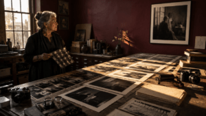
A company can carefully specify exactly how its logo should appear and still look like several different brands from one page to the next.
The logo may have strict rules for clear space, minimum size, approved colors and prohibited alterations. Typography may be standardized. Designers may have precise hexadecimal values for every brand color.
Then photography gets described with three words:
“Authentic. Modern. Professional.”
That is not enough.
Photography occupies enormous amounts of visual space across modern websites, ecommerce stores, advertisements, social media, presentations, recruiting campaigns and email. In many layouts, the photograph is significantly larger than the logo.
Yet brands routinely control a 100-pixel logo more carefully than a photograph occupying half the screen.
Current brand systems demonstrate why that approach is increasingly outdated. The University of Helsinki divides imagery into categories including brand, topic, science and community photography, with different purposes and treatments. New York Tech asks photographers to prioritize authentic people, environments and moments while considering composition, perspective and space for accompanying graphics. The U.S. Office for National Statistics brand system goes beyond logos and colors to include dedicated standards for photography, videography, illustration and iconography.
Photography is not decoration added after a brand identity has been designed.
It is part of the identity. Creating a Brand: The Visual Strategy Behind Modern Market Leaders.
A Logo Cannot Control The Rest Of The Photograph
Traditional brand guidelines usually devote substantial attention to logos.
That makes sense.
A logo needs consistent proportions, spacing, colors and placement. Stretching it, recoloring it or putting it against an unreadable background can weaken recognition.
But correct logo usage cannot rescue inconsistent imagery.
Imagine a company publishing four advertisements during the same month.
One uses a dramatically lit studio portrait with black shadows.
Another uses a brightly exposed stock photograph of smiling employees.
The third uses a desaturated documentary photograph.
The fourth uses an AI-generated futuristic office.
Place exactly the same logo in the corner of all four images and the problem remains.
The logo is consistent.
The visual world is not.
That distinction explains why mature brand systems increasingly treat photography as its own visual language.
The University of Helsinki’s image guidelines are a useful example. Its brand book asks imagery to communicate genuine human experiences and divides photographs according to their communication function. Community images are intended to document everyday university life authentically, while dedicated brand images receive more deliberate planning and particularly high technical requirements.
That is much more actionable than simply requesting “good photography.”
It tells photographers what kind of world the organization wants its audience to see.
Photography Guidelines Define What The Brand’s World Looks Like
A useful photography guide begins with a larger question than camera settings:
What should life inside this brand look and feel like?
Consider two fictional outdoor brands.
Both could use the same sans-serif typography. Both could have green logos. Both could sell similar products.
The first brand might define its photography around solitary people in enormous landscapes, cool morning light, subdued colors and wide compositions.
The second might prioritize groups of friends, close camera distances, direct sunlight, saturated colors and energetic movement.
Even if both remove their logos, viewers could eventually learn to distinguish them.
That is the real objective of photography guidelines.
Recognition should not depend entirely on repeatedly stamping a mark onto an image.
Photography can create its own recognizable visual behavior.
“Authentic” Is Too Vague To Be A Photography Guideline
Authenticity is probably one of the most frequently requested qualities in contemporary brand photography.
The problem is that almost everyone interprets it differently.
Does authentic mean natural light?
Does it mean people should not look at the camera?
Does it mean real employees rather than professional models?
Should locations contain clutter?
Can photographs be retouched?
Should subjects smile?
Are studio portraits allowed?
Without more specific instructions, two photographers can receive the same request for “authentic photography” and produce completely different work.
Published brand systems show how the idea can be made more concrete.
New York Tech says its photography should capture real people, environments and experiences while favoring natural interactions, discovery and engagement over generic or overly staged imagery. Mutual of Omaha similarly describes its photographic setting as authentic, journalistic and unstaged, with people interacting rather than simply performing for the camera.
The useful lesson is not that every company should imitate that aesthetic.
It is that adjectives need to become observable photographic decisions.
Instead of saying “warm,” specify whether warmth comes from late-afternoon natural light, warmer white balance, environmental materials or wardrobe.
Instead of saying “human,” specify whether subjects should interact with each other, work naturally, acknowledge the camera or appear unaware of it.
Instead of saying “cinematic,” define contrast, perspective, composition and lighting.
A photography guideline becomes useful when a photographer can act on it.

Lighting Should Be Part Of Brand Identity
Lighting is one of the strongest ways to make photographs from different shoots feel related.
A brand might prefer soft directional window light.
Another could use hard sunlight and defined shadows.
A luxury company might prefer controlled studio illumination with deep contrast.
A healthcare organization could favor bright, natural environments with clearly visible faces.
A technology company might choose crisp neutral light rather than the blue-and-purple futuristic lighting that has become a visual cliché.
None of these approaches is universally better.
Consistency comes from choosing deliberately.
Photography guidelines should therefore explain preferred light characteristics rather than merely requesting well-lit images.
Useful guidance can address natural versus artificial light, contrast, shadow depth, color temperature, time of day and whether direct flash belongs in the system.
It should also explain exceptions.
A brand that normally uses natural daylight may still need event photography at night. The guidelines should help photographers preserve the brand’s character when ideal conditions are unavailable.
Composition Needs Rules Too
The way subjects occupy a frame can become recognizable.
Some brands need wide environmental compositions because location matters.
Others need intimate close-ups because human detail matters.
Ecommerce brands may need consistent product scale.
Editorial brands may prefer asymmetry and negative space.
The guidelines should establish those tendencies.
They should also account for what happens to photographs after the shoot.
A beautiful horizontal image may fail completely when a social team needs a vertical version.
A tightly framed portrait may leave nowhere to place a headline.
A subject positioned at the edge may disappear when a website automatically crops the image on mobile.
Good photography guidelines anticipate those situations.
The University of Helsinki explicitly notes that its brand images often need to function in different channels and formats, so horizontal and vertical usability matters. New York Tech similarly advises considering space for copy and graphic elements when composing photographs.
That means photographers should not merely deliver more images.
They should deliver useful variations.
A brand shoot may require a wide establishing frame, medium composition, close detail, horizontal version, vertical version and compositions with intentional negative space.
Those are production decisions that can be documented before anyone picks up a camera.
People Need More Guidance Than “Show Diversity”
People are among the most powerful and sensitive elements in brand photography.
Guidelines should therefore address representation without turning human subjects into visual tokens.
A useful system can define the kinds of interactions the brand wants to document, how much posing is appropriate, whether people should acknowledge the camera, what environments make sense and how wardrobe should interact with the broader visual identity.
It should also establish what the brand wants to avoid.
That could include forced enthusiasm, artificial meetings, stereotypical roles, implausibly pristine workplaces or the familiar stock-photography scene where several people stare happily at a laptop.
The goal should not be to manufacture a single approved type of person.
It should be to establish a consistent way of photographing people with respect and relevance.
The University of Arizona College of Medicine–Phoenix, for example, describes photography as an important brand tool and asks photographers to consider the purpose, intended use and message of an image before shooting. Its guidance emphasizes purposeful and emotionally meaningful photography rather than images created simply to fill space.
That question—why does this photograph exist?—belongs in almost every brand photography brief.
Locations Are Part Of The Brand Story
A location communicates before a viewer consciously analyzes it.
A polished glass office suggests something different from a workshop.
A family kitchen communicates differently from a studio cyclorama.
A crowded urban sidewalk has a different emotional vocabulary from an empty landscape.
Brands therefore need to decide how much environmental context their photographs should contain.
The answer will depend on what the organization actually does.
A university may need recognizable campus environments.
A manufacturer may need real production facilities.
A restaurant should probably show actual food and hospitality environments.
A fashion label might intentionally create an invented visual universe.
A software company may decide that showing technology without showing people creates imagery that feels too abstract.
Photography guidelines can prevent teams from selecting locations simply because they look attractive.
The better question is whether the location makes the brand story more specific.
Product Photography Needs The Same Discipline
The need becomes even clearer when a company sells physical products.
Customers may encounter dozens of product photographs before reading much copy.
If one item is photographed from slightly above, another straight ahead and another from below, the catalog begins to lose cohesion.
The same happens when product scale changes unpredictably, backgrounds vary, shadows point in different directions or white balance changes between shoots.
Guidelines can establish a repeatable system covering camera angle, lens perspective, product orientation, background, lighting direction, shadow treatment, crop, scale and color accuracy.
Lifestyle photography needs a related but distinct set of rules.
Where should the product appear?
Does someone hold it?
How much environment should be visible?
Should the image demonstrate function or create aspiration?
How much visual priority does the person receive relative to the product?
These decisions influence brand perception just as much as logo placement.
Retouching Should Have Boundaries
Photography guidelines should continue after the shutter is pressed.
A company can commission visually consistent photography and then destroy that consistency through inconsistent editing.
Post-production rules can define contrast, saturation, white balance, skin treatment, sharpening, grain, background cleanup and product-color accuracy.
They can also define ethical boundaries.
For people, the brand should decide how aggressively temporary blemishes, skin texture, wrinkles, body shape and other physical characteristics may be altered.
For products, guidelines should make clear when retouching improves presentation and when it begins misrepresenting the object being sold.
For documentary or institutional imagery, manipulation may require even stricter limits.
The objective is not to force every photograph through one preset.
It is to create a recognizable editing philosophy.
AI Images Make Photography Guidelines More Important
Generative AI has added an entirely new reason to formalize image standards.
A brand team can now create large quantities of imagery without commissioning a conventional photoshoot.
That makes production faster, but it does not automatically make the output consistent.
Someone still has to decide what environments belong to the brand, how people should appear, what lighting is acceptable, which colors dominate, how products must be represented and what visual characteristics should never appear.
The guidelines also need to address a question that barely existed in traditional brand books:
When is synthetic imagery appropriate at all?
Organizations are already taking different positions.
Some permit AI-assisted workflows under defined conditions. Others restrict generated imagery when audiences could reasonably interpret it as evidence of real people, places or experiences.
There is no single rule that fits every organization.
What matters is making the rule explicit.
Image Provenance Is Becoming A Brand Issue
Brand photography guidelines increasingly have another job: documenting where images came from and what happened to them.
Adobe updated its organizational Content Credentials documentation on August 26, 2026, as companies confront growing questions around content authenticity, AI use and asset integrity.
Adobe’s Content Credentials can carry information about an asset’s creator, editing history and tools used during production. In Adobe Experience Manager, credentials can remain attached when supported assets are downloaded, published or shared.
For brands, this introduces a new dimension to image governance.
Photography guidelines traditionally answered:
How should our images look?
Modern guidelines increasingly need to answer:
Where did this image come from, who can use it and how was it changed?
Adobe’s Content Credentials documentation describes credentials as durable metadata that can accompany content through marketing workflows.
That does not mean every organization suddenly needs the same technical system.
It does mean provenance deserves a place beside aesthetics.
A sophisticated photography guide can establish whether teams must preserve creator credits, original files, licensing information, model releases, editing histories or AI-generation information.
Guidelines Should Define What Not To Photograph
Some of the most useful pages in a brand book are the ones showing what not to do.
Photography needs the same treatment.
A company might reject photographs that are excessively staged, heavily filtered, visually generic or disconnected from the organization’s actual environment.
It may avoid particular lighting treatments, extreme lens distortion, artificial-looking poses or cluttered compositions.
The important point is to explain why an example fails.
“Do not use this photograph” teaches very little.
“This expression feels forced and conflicts with our preference for observational interactions” teaches a photographer what to change next time.
Negative examples convert taste into repeatable judgment.
A Practical Photography Guide Should Answer Real Production Questions
A useful document does not need to become a hundred-page photography textbook.
It needs to resolve the decisions that repeatedly create inconsistency.
At minimum, a brand photography system should define:
- Purpose and emotional tone: What should photographs communicate, and what should they never communicate?
- Subjects and people: Who appears, how are people represented and how posed or candid should they feel?
- Locations and environments: Which settings belong naturally to the brand’s world?
- Lighting and color: What kinds of light, contrast, saturation and color treatment create the desired identity?
- Composition and crops: How close should the camera be, where should subjects sit in the frame and what channel variations are required?
- Product treatment: How are scale, angle, backgrounds, shadows and color accuracy standardized?
- Post-production: What can be retouched, what should remain natural and how consistent should image grading be?
- AI and provenance: When can generated or AI-edited imagery be used, and what origin or editing information should be preserved?
- Technical delivery: Which dimensions, resolutions, file types, aspect ratios and accessibility requirements apply?
- Do and don’t examples: What does success look like, and which recurring visual mistakes weaken the identity?
Those rules should be accompanied by photographs rather than explained only through prose.
The objective is not to remove creative judgment.
It is to give creative judgment a recognizable direction.

The Best Test Is To Hide The Logo
There is a simple way to evaluate whether photography is contributing to a visual identity.
Take several photographs from the company’s website, advertisements, social channels and presentations.
Hide every logo.
Remove the copy.
Then put the images next to each other.
Do they appear to come from the same organization?
Are there recurring characteristics in the lighting?
Do people inhabit the images in similar ways?
Does color behave consistently?
Are environments related?
Does the camera maintain a recognizable relationship with subjects?
Does retouching follow the same philosophy?
Or does the collection look like unrelated stock photographs gathered by different teams?
A logo can identify who published an image.
Strong photography guidelines can make the image begin communicating that identity before the logo appears.
That is why a modern brand book cannot stop at the mark, typeface and color palette.
The logo may be the smallest expression of a visual identity.
Photography is often the world surrounding it.