Let’s face it—most brand colors are like a messy closet. They’re chaotic, clashing, and full of neon. In this guide, we’ll sort out your colors like a pro. We’ll use the Pantone swatch book to check your colors.
We’ll figure out if your “Unconventional Blue” is useful or just taking up space. This part is about creating a color wardrobe that works as well as a great blazer. It should look good on your website and in photos.
It’s important to make sure your colors are accessible. Think of it like avoiding fashion police or ADA issues. Colors can greatly affect how people feel about you, making up to 90% of their first impression.
Are you ready to change your colors? Let’s learn how to match your logo and colors with your audience. Check out more on capsule wardrobes and color palettes to improve your style.
Skin tone undertone test find flattering hues within brand colors
Ready to unlock the secrets of color psychology? Let’s explore how to find flattering hues for your skin tone. This journey will help you understand your undertones and boost your brand identity.
Think of this as a stylist checking your skin tone. It might feel a bit awkward, but it’s worth it. Knowing your undertones is key to choosing the right colors. Some shades make you look radiant, while others might not.
Here’s a quick guide to help you identify your undertone:
- Warm Undertones: Look for hues like terracotta, golden yellows, and earthy greens. These colors make your natural glow shine.
- Cool Undertones: If you rock shades like emerald, sapphire, or icy blues, you’re in the cool category. These colors make you look fresh and vibrant.
- Neutral Undertones: Lucky you! Dusty roses, soft taupes, and muted colors work wonders for your skin, giving you versatility.
It’s not about changing who you are; it’s about finding that one shade that makes you look amazing. Imagine your brand’s teal looking fabulous, but it makes you look different under the camera. The right colors can make all the difference.
So, next time you’re picking outfits for a photoshoot or a brand event, remember this test. Pair your personal hues with your brand colors, and you’ll look great and feel confident. When you feel good in what you wear, it shows!
Tonal harmony balance of lights mids darks for depth on camera
Tonal harmony is key to making visuals pop. It’s not just about filters; it’s about balancing lights, mids, and darks. This balance adds depth, making your on-camera presence as engaging as a Christopher Nolan film.
Good tonal harmony avoids the flat look of elevator music. It’s like the difference between a vibrant painting and a dull wall. The FIT Spectrum Palette helps, with colors that improve legibility and consistency.
The chiaroscuro effect uses your brand’s colors for striking contrasts. Your Zoom calls can look like a Renaissance masterpiece. It’s not just about looks; it’s about grabbing attention with authority.
Using color theory and Ansel Adams’ zone system, your brand palette will shine under the ring light. Whether in a boardroom or on livestream, mastering tonal harmony boosts your visual appeal.
Monochrome vs complementary when to keep simple or add contrast
Choosing colors for your brand is like deciding between a quiet evening with a book or a vibrant night out with friends. Both monochrome and complementary schemes have their charm, but understanding their psychological impact can make all the difference.
Monochrome palettes whisper trust and sophistication. Think of Steve Jobs in his iconic black turtleneck—effortlessly chic and timeless. This approach is perfect for brands aiming to convey stability and reliability. It’s a safe choice, but one that can sometimes lack excitement.
On the other hand, complementary color schemes burst onto the scene like a fireworks display. They scream energy and creativity, ideal for brands that want to disrupt the status quo. Imagine a tech startup with bold colors that challenge the norm. This approach can be chaotic, but when executed well, it captures attention and fosters engagement.
So, when should you opt for a monochrome look? If your brand exudes a sense of tradition and authority, stick with a simple palette. But if you’re looking to make a statement, don’t shy away from the vibrancy of complementary colors. Just be cautious of the dreaded “clown car” effect—too many colors can overwhelm your audience.
In the end, the choice between these two styles boils down to your brand’s message. Are you a legacy brand that whispers confidence, or a bold newcomer ready to shout your vision? The right color scheme can elevate your brand, so choose wisely.
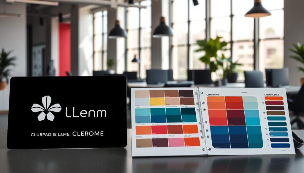
For more insights on crafting your brand’s color palette, check out this detailed guide.
Textures echo brand feel matte luxe minimal rugged eco cues
Textures play a big role in branding, shaping how we see a brand. A cashmere sweater and a burlap sack look different but feel different too. Textures show a brand’s personality in ways colors can’t.
A matte finish says “luxe minimalism,” like a Scandinavian spa. It shows quality without being flashy. Rugged textures, on the other hand, shout “I compost my own granola.” They appeal to those who care about the planet.
Think of your brand’s feel as a tactile experience. Like a wardrobe capsule, every detail matters. Each texture should add to your brand’s story.
Brands like Patagonia use eco-friendly textures to show their values. Apple’s smooth surfaces reflect their sleek, modern vibe. These textures make your brand feel real, even online.
The textures you pick are more than looks; they tell your brand’s story. What story do your textures share? For more on building trust through branding, check out this resource.
Capsule build 5 mix and match pieces for multiple looks
Ever thought about how a wardrobe capsule can elevate your brand identity? Let’s explore how to create a capsule wardrobe for your brand. It’s not just about clothes; it’s about creating a visual identity that speaks to you.
Imagine starting from scratch. You’d choose colors that look good together and make you feel confident. These colors are like your brand’s core colors, from ivory to espresso. They’re versatile and ready for any event.
Now, let’s declutter your brand assets. We’re creating a capsule of five essential pieces. Think of them as your brand’s must-haves, like a navy blazer or a white tee. They’re perfect for any occasion, from a big presentation to a casual post on Instagram.
Consider the Neutral Edit concept. This idea applies to your wardrobe and your brand’s visual elements. The goal is a cohesive brand wardrobe that looks polished, even when you’re tired.
So, what are these five essential pieces? Here’s a quick rundown:
- 1. The Base Color: Choose a neutral that serves as the foundation.
- 2. The Accent Color: A bold hue that adds personality.
- 3. The Textured Element: Something to add depth, like a matte or luxe finish.
- 4. The Pattern: A subtle print that can elevate the overall look.
- 5. The Versatile Piece: Something that transitions easily from day to night.
With these five pieces, you can create many looks that stay true to your brand. It’s all about editing and a bit of humor. Who doesn’t love a joke about choosing the right accent color?

Background pairing light vs dark seamless concrete greenery office sets
Your background is more than just a backdrop; it’s a key element that can boost or harm your brand’s visual story. When it comes to headshots, the choice between light and dark backgrounds is huge. It’s like the stage for your brand; it can shine or fade.
The FIT Adaptive Palette concept is a game-changer. It lets you pick from a wide range of colors for your images. Your headshot won’t look like a 90s corporate hostage video. Instead, it will show off your brand’s personality, matching your colors perfectly.
Let’s get into the details. A seamless background gives a clean, professional look. Concrete settings add an industrial feel. Greenery brings life, making your headshot stand out without looking like a gardening catalog. Each option has its own charm and can match your brand palette in special ways.
| Background Type | Best For | Brand Vibe |
|---|---|---|
| Seamless Paper | Professional Headshots | Clean, Minimalist |
| Concrete Wall | Creative Industries | Edgy, Urban |
| Greenery | Wellness Brands | Fresh, Inviting |
| Office Sets | Corporate Profiles | Serious, Trustworthy |
The right background should match your brand’s vibe. A dark background can be mysterious, making you seem more intriguing. A light background can feel open and welcoming. Pick carefully, as this choice greatly affects how people see you.
In conclusion, the right background is a key player in your brand’s visual story. Whether you choose seamless designs, concrete textures, or lively greenery, make sure it fits your brand palette and boosts your headshot’s impact.
Industry examples finance tech wellness creative legal real estate
Colors can say a lot more than words in branding. Each industry uses color psychology to connect with its audience. Let’s see how different sectors use color to share their messages.
Finance often uses navy blue for trust and stability. Think of Goldman Sachs’ classic branding. This color shows reliability, making it popular in finance.
The tech industry loves electric blue and bright greens. These colors show innovation and creativity. Facebook and Twitter use them to feel connected and forward-thinking.
In wellness, sage green is key. It’s calming and promotes healing, great for yoga and health brands. Using aggressive red in wellness? That’s like a therapist yelling at you—it’s not helpful.
Creative agencies use magenta to stand out. This bold color shows their innovative spirit and desire to be noticed.
Legal firms stick to charcoal gray for authority and professionalism. It’s serious and trustworthy, important in law.
In real estate, warm neutrals are favored. They make people feel at home and comfortable. Think of granite countertops and cozy living rooms.
To wrap up, color psychology is key in branding. Each color choice reflects a brand’s values and emotions. So, when you see a brand’s colors, think about what they mean.
Avoiding color cast practical lighting and wardrobe notes
Lighting can be a hero or a villain in your quest for tonal harmony. A bad lighting choice can change your look from radiant to ghastly. To keep your brand colors true, let’s explore how to avoid color casts.
A cheap LED can turn your glow into a bad hue. You might look chic, but your shirt could reflect in a scary way. To avoid this, you need to choose your lighting wisely.
Fluorescent lights are the enemy of tonal harmony, casting a greenish tint. This can make you look like you’re from a sci-fi movie. Instead, use natural light or soft white bulbs that make your skin look good. The goal is to enhance your brand colors, not mess them up.
Here are some tips to make sure your wardrobe works with your lighting:
- Use a Gray Card: This tool helps you see true colors in your environment. It’s like a cheat sheet for lighting!
- Choose Fabrics Wisely: Pick materials that won’t clash with your brand colors. Avoid shiny fabrics that reflect light badly.
- Test Before You Shoot: Take test shots in different lights to see how your outfit looks. This can prevent disasters.
To better understand these points, here’s a quick reference table:
| Lighting Type | Effect on Colors | Best Use |
|---|---|---|
| Fluorescent | Greenish cast | Avoid for headshots |
| LED | Can vary; check quality | Good for general use |
| Natural Light | True color representation | Best for branding images |
Getting tonal harmony is more than just what you wear. It’s about how you light it. It’s like a survival guide for those who love to look good. So, when you’re getting ready for a shoot, remember: it’s not just what you wear, but how you light it that matters.
Planning sheet with printable palette swatches
Creating a brand color wardrobe is more than just a fun idea. It needs careful planning and action. I’ve made a planning sheet with printable palette swatches to help you. This tool makes sure your brand colors match everywhere.
This sheet acts as your color helper. It has HEX, RGB, and CMYK values. This makes it simple to share your brand colors with designers or photographers. Say goodbye to “Unconventional Pink” and “Regretful Beige” clashing. Use this tool to keep your look consistent, from LinkedIn to your website footer.
The planning sheet follows FIT color guidelines. It’s like having your own Pantone chip set, but cheaper. Just print it and keep it nearby. It helps you choose colors for photoshoots or website updates that fit your brand.
Having a well-chosen brand color wardrobe can boost your professional image. So, grab your swatches and let’s make sure your colors tell your brand’s story!